Aica
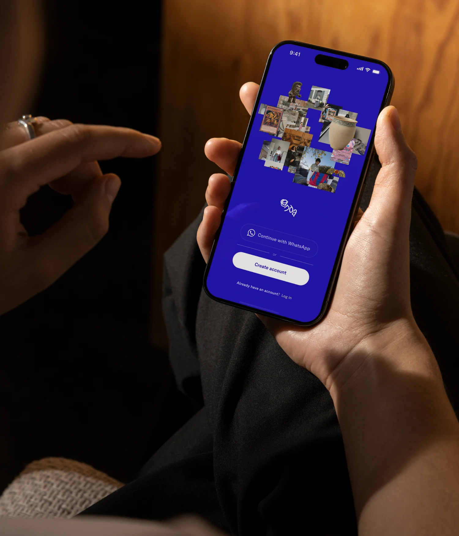
Collectivo
Coming soon...
Role:
Visual Identity
Year:
2020
Coming soon...
Role:
Creative Direction
Art Direction
Brand Identity
Visual Identity
Motion Design
Web Design
Web Development
Visit Website
tbd
Year
2026
Context:
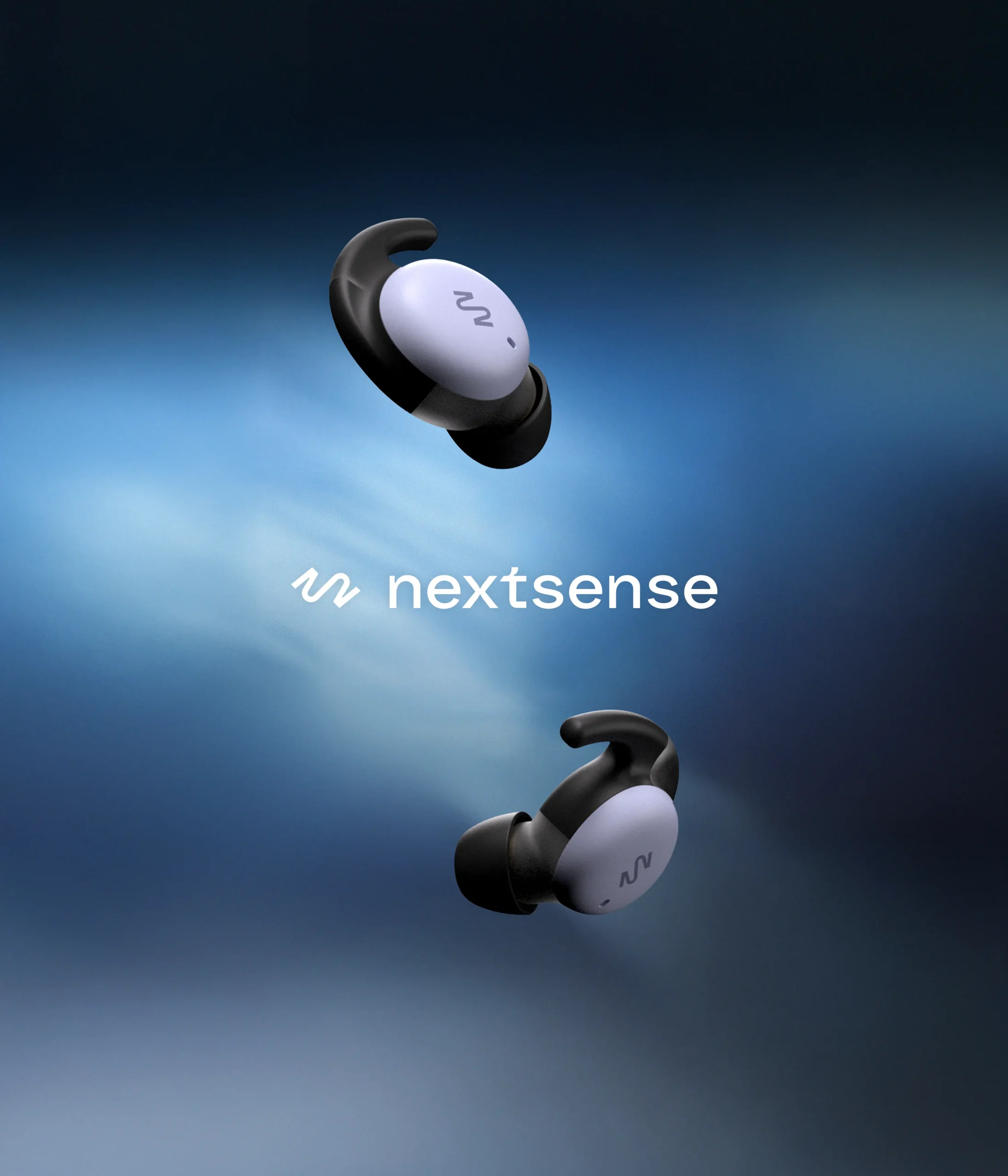
In a saturated wearable market where devices promise better sleep through indirect metrics, NextSense emerges to close the gap between estimated data and true brain insight. Founded in Mountain View, California, the company brings real-time brain sensing out of the lab and into everyday life through truly wireless earbuds equipped with clinical-grade EEG sensors. Its mission is to democratize brain health by giving people direct access to the intelligence of their own bodies.
To establish itself within the category, the brand evolved into a strategic system that balances scientific rigor with human warmth. The identity combines a flexible, dynamic grid, dual typography: a warm serif paired with a precise sans serif, and an expressive color system that translates complex data into clear visual experiences. With a tone that is confident, expert, and approachable, NextSense not only introduces advanced technology, but redefines how we understand, interpret, and live with our own brain activity.
Solution:
As the company grew and generated its product offering, NextSense required a strategic evolution to enter a saturated sleep and wellness wearable category. The brand needed depth, precision, and presence, combined with emotion, humanity, and a clear point of view. It had to be modern, user-centered, and accessible, without sacrificing its scientific and medical credibility. Its goal: to democratize brain data, offering not only advanced technology, but meaning and context for the future of the category.
The brand tone is confident and expert in science and technology, yet warm and approachable. NextSense speaks to researchers and healthcare professionals, as well as to users and wellness enthusiasts. Its voice reflects a calm authority, transforming the way we understand and access brain data.
The identity system is built on a flexible, dynamic grid that enables scalable, coherent compositions with personality, combining structure and visual play without losing clarity or consistency. Its dual typography pairs a warm, human serif with a precise sans serif, balancing trust, accessibility, and scientific authority. The color system is logical yet expressive: flexible tones that reflect different moments of the day, and gradients that reinforce product functions and states, translating complex data into clear and engaging visual experiences.
This identity reflects the brand’s democratic intent: warm, confident, approachable, and even playful, never cold or minimalist, communicating an experience that integrates science, wellness, and personality, and creating a club users feel proud to belong to. Altogether, the identity system speaks advanced, technology, scientific rigor and lifestyle.
Deliverables
Creative Direction
Art Direction
Visual Identity
Brand Guidelines
Motion Design
Web Design
Web Development
CG Art
Collateral
Credits
Logotype: Bastarda Type
Web Design & Development [Studio Contra]
3D/Motion Lead [David Caro]
Motion [Nicolas Varela @_polygraph_]
Photographer: Sophie Sahara
NextSense Team
John Horstmann [Director of Marketing]
Caitlin Shure, PhD [Head of Product and Content]

ThirtyTwo.Studio
32S
© 2025-2026
ThirtyTwo.Studio
© 2025-2026
LinkedIn
Instagram